
- July 29th, 2019, 10:14 am#4921577
I keep seeing the bootleg version of the Ghostbusters logo popping up in fan creations and some licensed products.
So... just a friendly reminder.
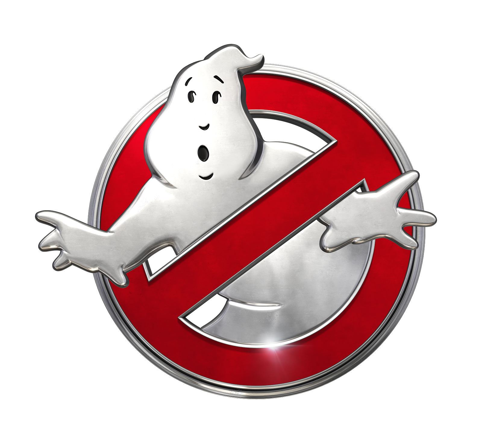
If the logo doesn't have a a chin, has a lower and longer waistline, and generally poor line work, it's likely the bootleg logo that's been floating around on free vector art websites for years. Do not use it.

Sony should really provide their vendors with brand guidelines so that thing stops popping up.
If you must use a free vector logo, this one is at least closer to true. It's a an exact vector duplicate of the Butterwicks iron-on Ghostbusters logos from the '80s.

Ironically, it may be more accurate than the recent vector version Sony is using. You can compare it to the first scene from the '84 film where the car comes to a stop outside of the Sedgewick. Note the shape of the eyes:

Here it is again without the black fill:

This one without the black fill was loaded to Sony's creative assets page back in 2016 and can still be downloaded from Spook Central:

There are a few other iterations of the official logo.
When in doubt, make sure the logo has a chin.
There's a beveled version used for the 2009 video game:

2016 saw this logo brought into some ancillary use:
As well as this:

This thinner prohibitory mark showed up on the car in 2016:

And this one Sean Bishop fixed the arm/torso issue on:

As seen on Sean's car in Boomerjinks thread:

So... just a friendly reminder.
If the logo doesn't have a a chin, has a lower and longer waistline, and generally poor line work, it's likely the bootleg logo that's been floating around on free vector art websites for years. Do not use it.
Sony should really provide their vendors with brand guidelines so that thing stops popping up.
If you must use a free vector logo, this one is at least closer to true. It's a an exact vector duplicate of the Butterwicks iron-on Ghostbusters logos from the '80s.
Ironically, it may be more accurate than the recent vector version Sony is using. You can compare it to the first scene from the '84 film where the car comes to a stop outside of the Sedgewick. Note the shape of the eyes:
Here it is again without the black fill:
This one without the black fill was loaded to Sony's creative assets page back in 2016 and can still be downloaded from Spook Central:
There are a few other iterations of the official logo.
When in doubt, make sure the logo has a chin.
There's a beveled version used for the 2009 video game:
2016 saw this logo brought into some ancillary use:
As well as this:
This thinner prohibitory mark showed up on the car in 2016:
And this one Sean Bishop fixed the arm/torso issue on:
As seen on Sean's car in Boomerjinks thread:

 - By takimeta
 - By GhostbusterRN
 - By Shred Dog20
 - By mrmichaelt
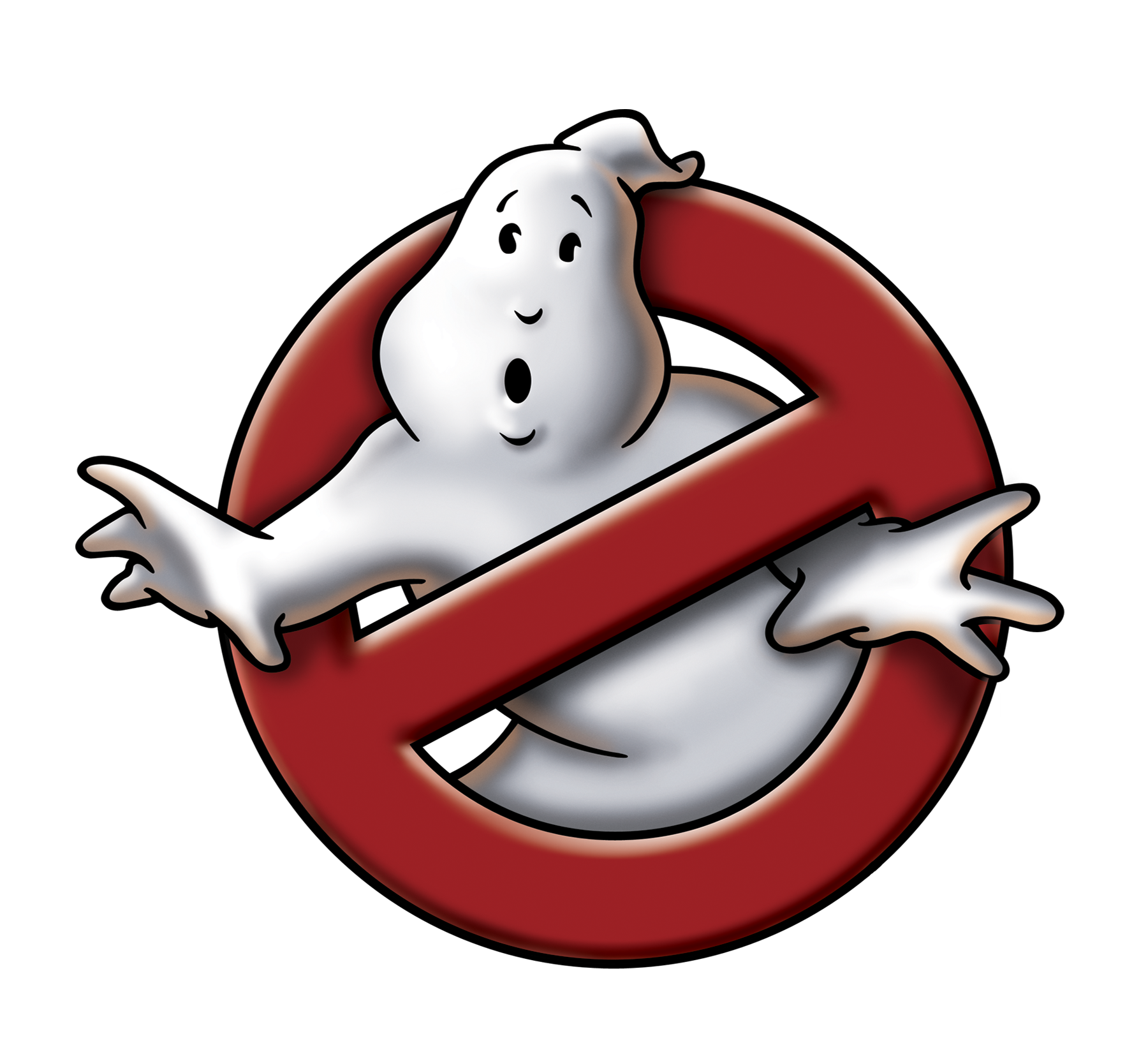